Standing in front of a colour chart with 25+ options can feel overwhelming. Grey or buff? Charcoal or slate? Will that warm sandstone complement your red brick, or clash horribly?
Don't worry – after 25 years of helping homeowners across Warrington and Cheshire choose the perfect driveway colours, we've learned exactly what works and what doesn't. Here's our complete guide to getting it right.
The golden rule: look at your house first
The most common mistake people make is picking a driveway colour they love in isolation, without considering how it sits against their property. Your driveway should complement your home, not compete with it.
Before you look at any samples, take note of:
- Your brick or render colour
- Your roof tile colour
- Your front door and window frame colours
- Any existing stonework, walls, or fencing
- Your neighbour's driveways (you don't want to clash there either)
Colour matching by house type
Red brick properties
Red brick is wonderfully versatile and works with a wide range of driveway colours. Best choices are charcoal, slate grey, buff or sandstone. Neutral greys provide elegant contrast; warm buffs create harmony. Avoid matching brick red exactly (too matchy) or bright colours that compete with the brickwork for attention.
White or cream rendered properties
Light-coloured houses offer the most flexibility – almost anything works. Charcoal for drama, buff for warmth, silver grey for contemporary. Our most popular choice for rendered properties is charcoal with a contrasting border.
Grey or dark rendered properties
Modern grey-rendered homes need careful selection. Aim for silver grey, platinum or dove grey – each lighter than the render. A bold alternative is to go the other way entirely with sandstone or buff for striking contrast. The one thing to avoid is matching the exact grey of your render, which just looks flat and disappears.
Stone cottages and properties
Traditional stone houses suit natural tones. Best choices include rustic sandstone, bideford buff or purbeck stone – colours that echo the natural warmth of the stonework. Pair with York stone or ashlar patterns to complete the traditional look.
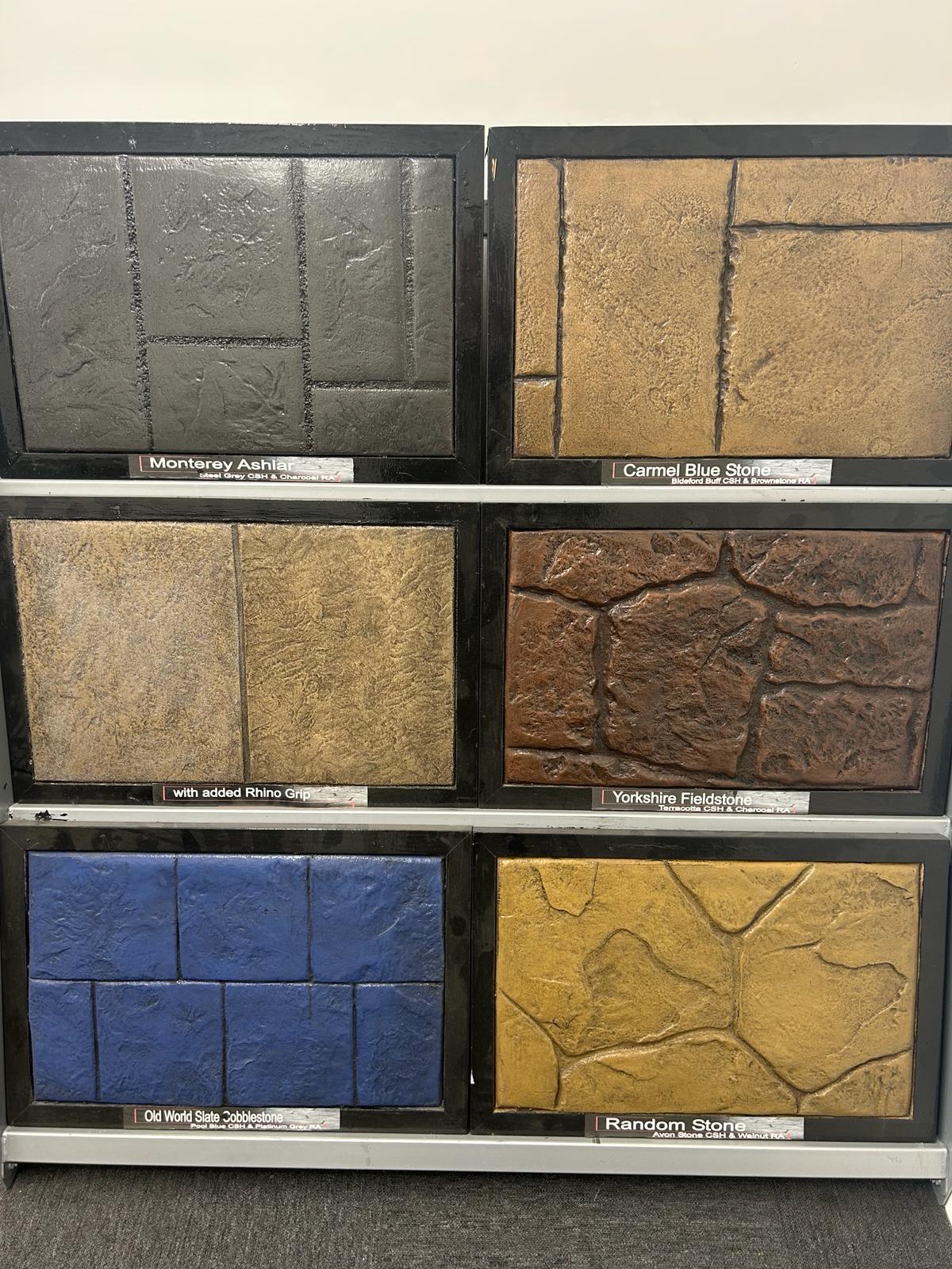
Understanding the two-colour system
Imprinted concrete uses two colours working together, which is why the samples always look richer than a single flat colour:
1. Surface hardener (base colour): The main colour you see – the background of your driveway.
2. Release agent (antiquing colour): Settles into the pattern joints and texture, creating depth and shadow. Typically a darker tone than the base.
Popular combinations we install again and again:
- Buff base + Walnut release → warm, natural-stone look
- Slate grey base + Charcoal release → contemporary, sophisticated finish
- Sandstone base + Mahogany release → traditional, inviting
What's most popular in Warrington & Cheshire?
Based on our installations over the past five years:
- Charcoal / slate grey (38% of jobs) – modern, works with most houses, hides tyre marks
- Buff / sandstone (26%) – warmer, suits traditional and red-brick homes
- Silver grey (18%) – contemporary, popular with new-builds and rendered properties
- Brick red / terracotta (11%) – bold, usually on period or heritage properties
- Other / bespoke (7%)
Light vs dark: practical considerations
Aesthetics aside, there are practical differences between lighter and darker colours.
Lighter colours (buff, sandstone, silver grey) make a driveway feel larger and more welcoming, but show dirt, oil stains and tyre marks more readily. They typically need more frequent rinsing.
Darker colours (charcoal, slate, anthracite) hide dirt far better and look sharper for longer with less cleaning – but can show limescale or efflorescence from hard water areas more obviously. They also get noticeably warmer in direct sun.
Don't forget the border
A contrasting border in a different colour and pattern can completely transform a driveway's look. A charcoal main area with a soldier-course buff border, for instance, adds definition and makes the whole drive feel more finished – like a framed painting rather than a wash of colour.
See before you decide
Screen colours lie. Brochure photography lies. Even colour swatches lie once they're against a real house in real daylight.
The only reliable way to choose is to see a physical sample board at your property, in the actual light, against your actual brick or render. We always bring 2-3 options on a site visit – it's a 20-minute conversation that saves you a 25-year regret.
A driveway is a big commitment. Spending a bit more time choosing the colour is always worth it.
If you'd like help picking the right combination for your home, get in touch for a free site visit. We'll bring samples, talk through the options honestly, and you can decide in your own time with no pressure.